


Featured Resource
Five Ways to Boost Government Efficiency with AI This Week
Watch our webinar on building secure AI solutions to modernize federal technology and boost efficiency. Learn about modern data management, governance, and automation to enhance workflows and drive innovation.
Featuring Yared Tsegaye, VP of Cloud Modernization and AI Solutions, and Matt Walker, Solution Director from AIS’s OCTO Solution Team, who will share insights and strategies to accelerate your AI adoption journey from pilot to production.
Learn more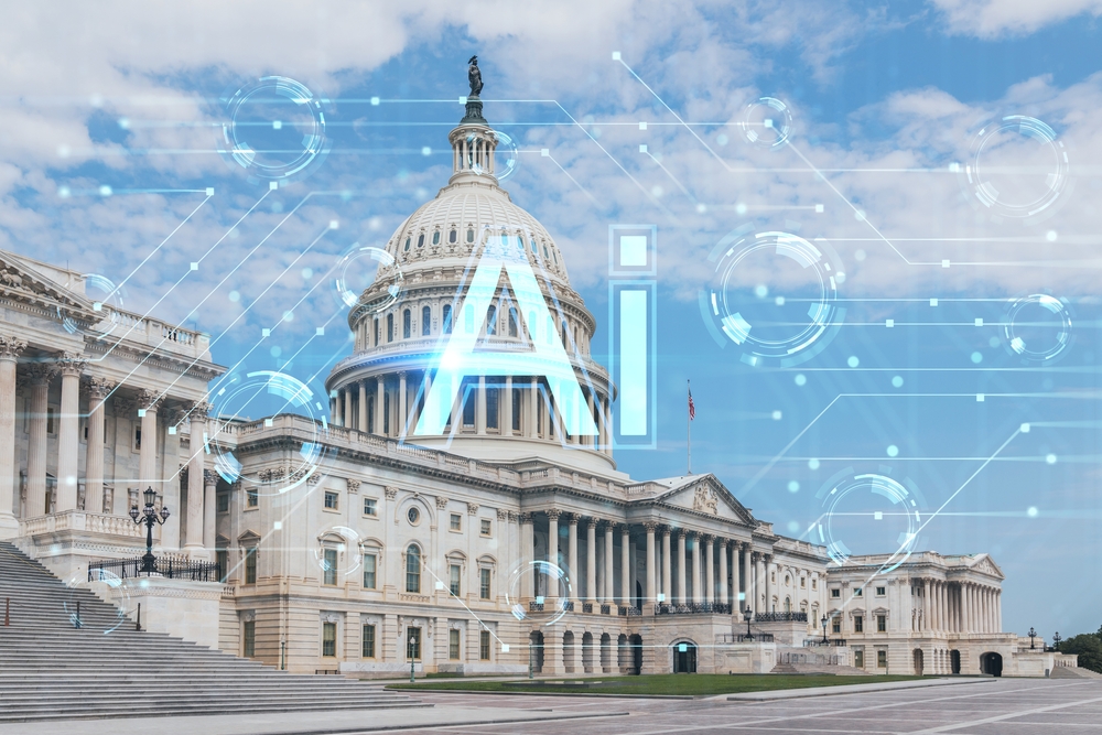
Loading...