


Introduction:
Custom Pages give developers full flexibility to customize the page and connect to multiple data sources. Moreover, it allows us to use the low-code logic by using canvas designer to edit and create the pages.
Features:
- Previously in the Model-Driven App, we could only add the existing view, charts, and dashboard into the Model-Driven App, which all correspond to one data source. But on a custom page, you can add one or more data sources by using the build-in connectors or creating a custom one.
- Instead of using the predefined layouts of the forms and views, you can create your page’s custom design and layout, which can be responsive too, using the containers.
- From one custom page, you can also navigate to form or view or another custom page on a click event of a button or selecting an item in the gallery.
Use-Case:
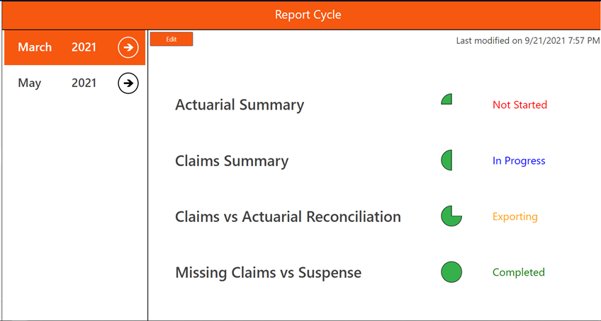
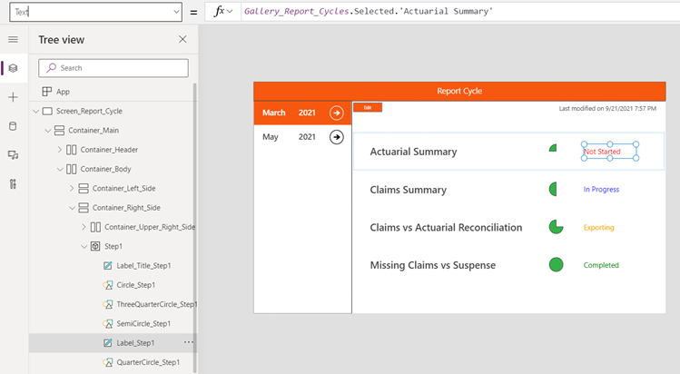
We have created a use case where we are using an existing table named Report Cycles. This table contains the Month and Year for which the reports are created. Each record contains four modules, and for each module, we have four statuses like “Not Started,” “In Progress,” “Exporting,” “Completed.” Each module goes from these four statues, and when it reaches the last status, i.e., “Completed,” it is marked as done.
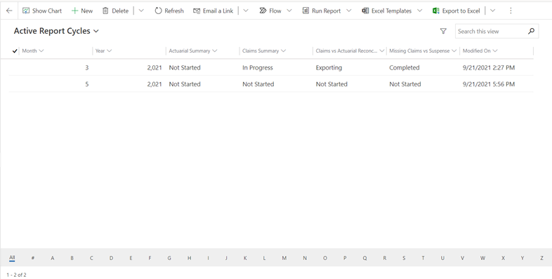
The classic view may look like this:
But with a custom page we can create this:
Major Components
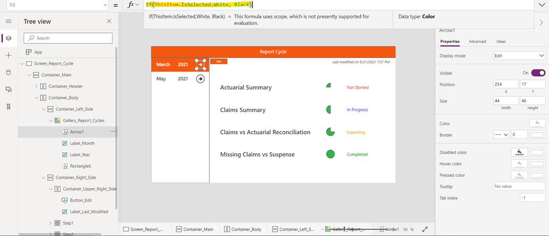
Vertical Gallery
The Data source for the Gallery is the Report Cycles table in Dataverse. The Gallery contains two labels and two shapes, Rectangle and Arrow. To show the selected item in a different color than the default one, I replaced the default value for the Template Fill property with:
Vertical Gallery: The Data source for the Gallery is the Report Cycles table in Dataverse. The Gallery contains two labels and two shapes, Rectangle and Arrow. To show the selected item in a different color than the default one, I replaced the default value for the Template Fill property with:
If(ThisItem.IsSelected,RGBA(246, 88, 16, 1),RGBA(0, 0, 0, 0))
The function return the color RGBA(246, 88, 16, 1) if the current item in gallery is selected otherwise return RGBA(0, 0, 0, 0) Which is white.
Similarly for the Arrow Shape Color and Labels Text gets changed to White when selected.
Colored Status
For each Module, there is one label that tells the status for it. The color for the text changes to red when it is “Not Started,” blue when it is “In Progress,” orange when it is “Exporting,” and Green when it is “Completed.”
This scenario has been achieved by applying the below formula for the Color property of the Label.
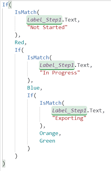
The IsMatch function takes two parameters and checks whether both of them are equal or not. If not, it will return false, and if equal, it returns true.
Edit Button
The edit button helps navigate the user to the edit form for the selected item. This again is a handy feature of custom pages. In this use case, it opens the edit form for the chosen item in the Gallery.
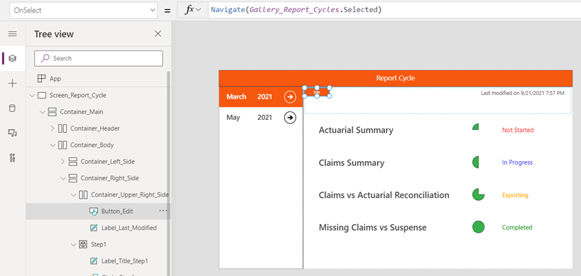
Navigate function is used, which accepts the target value of the selected item from the gallery here. This formula is given from the OnSelect property, which executes the given function when the button is clicked.
Status Indicator
This shape helps the user inform what percentage of the task has been completed. If we dive deeper, we will know that these are four different shapes, which become visible at different statuses. For example, the quarter circle shape has the given formula on the Visible property. This means when the Label equals “Not Stated,” the shape will be visible.
Similar to other shapes like Semicircle, Three Quarter circle, and Circle, they get visible when statuses are “In Progress,” “Exporting,” and “Completed,” respectively.
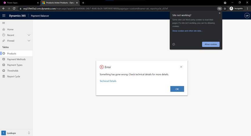
Errors
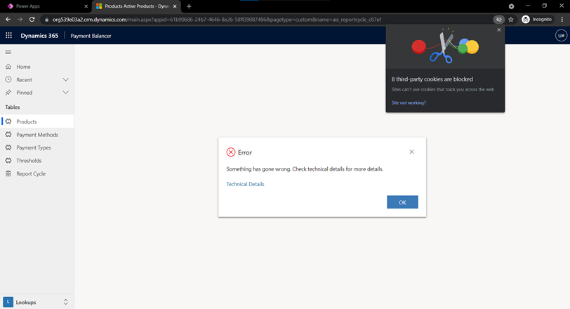
Sometimes you may encounter this error which can be resolved by enabling third-party cookies for the site.
Summary
This blog has explained the use of custom pages in Model-Driven App and its additional features, which were not there earlier. It also describes the pre-known canvas designer and its low code platform for custom pages. The blog covers a use case and its major components. Each component is explained with the formulas used and screenshots highlighting the details.
Resources: