


Bootstrap’s grid is extremely versatile. K. Scott Allen wrote about this recently: Why use the Bootstrap Grid?
However, as I learned more about how Bootstrap grid is used, I realized that there is a problem with the way I was using Bootstrap. Bootstrap’s grid is steering me away from the path of semantic markup.
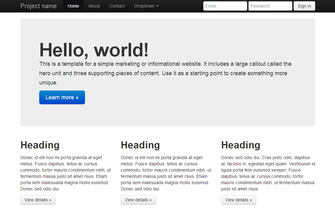
Here is an example using the source of the Bootstrap example – hero.html.
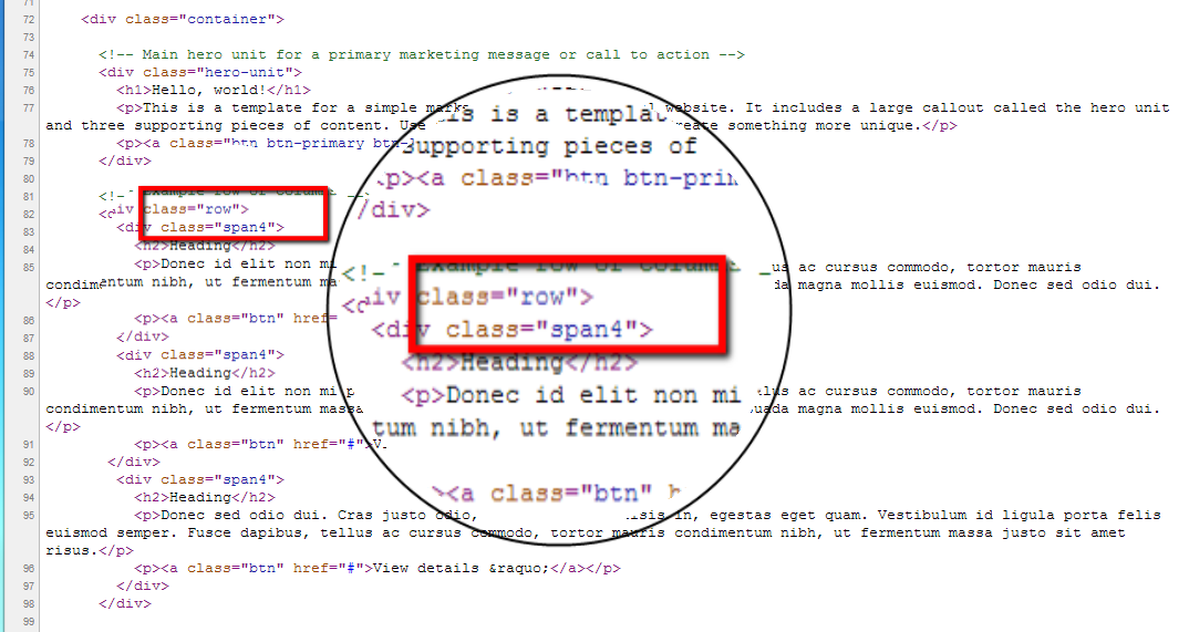
Bootstrap CSS classes (class=”row” and class=”span4″ in the example above) have to be applied to your HTML markup for your layout to use Bootstrap’s built-in styles. Specifying “span4” on your div sizes your div to span four columns of bootstrap’s default 12-column grid. From the point of view of someone interested in keeping the HTML semantically clean, this is an encroachment of the presentation instructions into the HTML markup. HTML markup should describe the meaning of the content, nothing else. Certainly not the presentation of the content. Specifying layout and other visual presentation is the job of CSS.
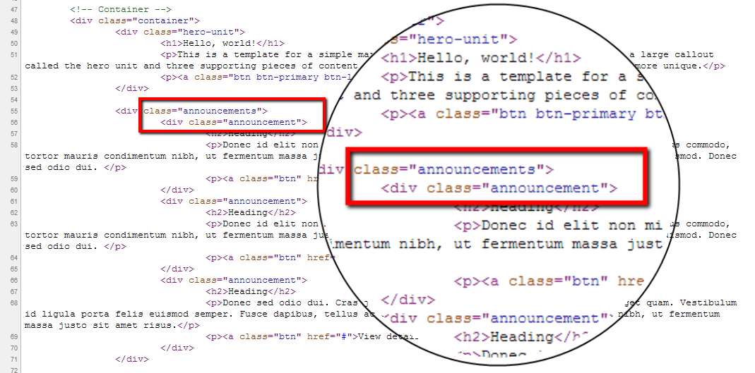
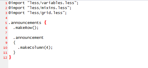
Ideally, your HTML markup should look like this:
The clean semantic HTML markup is not achievable when using Bootstrap the way most people use it. However, There is hope. Bootstrap is built on LESS. LESS is a CSS pre-processor. (You can read more about it by following the links at the end of this post.) Bootstrap comes with .less files, where its styles are defined in LESS format. These .less files are not included in the download from the main bootstrap page. These files are included in the source code download.
What’s so exciting about this is these LESS styles are available to you as mixins to be incorporated into your own style sheets. This way, it is possible to push the presentation/style down into your stylesheets, where they belong. By using mixins, your .less stylesheet will contain the calls to Bootstrap mixins.
There is still a problem with this. Although your content is now laid out with Bootstrap grid via the mixin calls, you have lost the Bootstrap’s built-in “Responsive” functionality. This is because the mixins provided in the Bootstrap’s source code download are not responsive.
To get around this issue, @barryvdh has posted a gist, which is basically a custom mixin to get around the variable scoping in the bootstrap mixins. Barry was kind enough to explain the issue and the workaround to me. After incorporating the custom mixin, the final less stylesheet looks something like this:
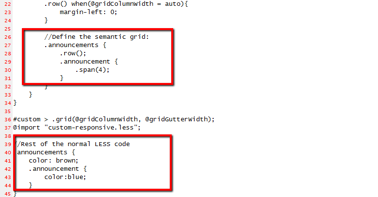
The top highlight sets up the responsive grid associated with your semantic tags (In this example, announcements and announcement). The rest of the styles associated with your semantic tags are also cleanly separated out as highlighted at the bottom of the stylesheet. With the custom mixin in place, the original hero.html example is reworked to look like this: ash.site44.com.
The code for this exercise is on my github repo.
Further reading: