


SharePoint in Microsoft 365 is a fantastic resource for building company intranets, and a lot of functionality is available without significant customizations.
Even various templates are available through Microsoft’s SharePoint lookbook, showcasing commonly used examples.
One feature missing from the default templates is an announcement banner, a specific request for intranets. For example, companies may want to announce important information to their employees who are prominently featured on the intranet home page, such as an office closure due to weather or a reminder that timesheets are due.
There are examples of how to accomplish this in the SharePoint Patterns and Practices (PnP) GitHub repository (such as react-app-announcements), but this requires the development of a SharePoint Framework (SPFx) application customizer.
However, there is an easier way to display an announcement banner with less effort and without knowledge of SPFx.
A quick summary on how to accomplish this is to:
- Set up a list in the intranet site to keep track of the announcements
- Create a custom list view for showing current announcements
- Use JSON formatting to modify that custom view
- Place a list view web part on the intranet home page and point it to the custom view
Announcements List Setup
First, set up the announcements list.
From the home page of the intranet, choose “New” > “List” in the menu.
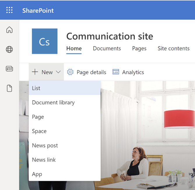
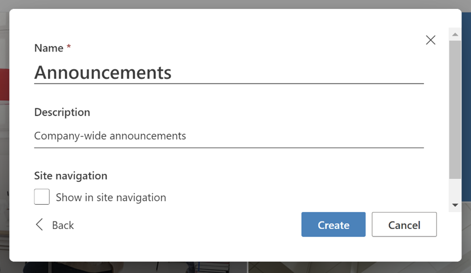
Then choose “Blank List.” In the dialog that appears, enter the list’s name (“Announcements”), add a description, and un-check the box to show in site navigation. Then press the “Create” button.
The new list is created, and the screen is redirected to the default list view.
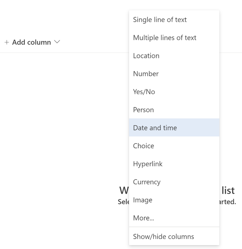
Columns will need to be added to the list to track when to show the announcements.
Press “+ Add column,” then choose “Date and time.”
In the slide-in panel for “Create a column,” enter and/or choose the following values for the column:
- Name: Start Date
- Description: The date that the announcement should begin displaying
- Type: Date and time
- Include Time: No
- Friendly format: No
- Default value: Today’s date
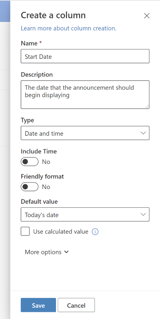
Then press the “Save” button to create the new column.
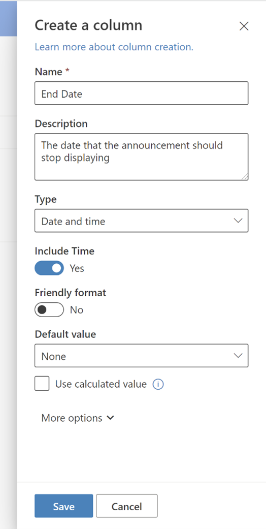
Next, press “+ Add column,” then choose “Date and time” again to add another column.
This time, enter and/or choose the following values for the column, then press the “Save” button to create the new column:
- Name: End Date
- Description: The date that the announcement should stop displaying
- Type: Date and time
- Include Time: Yes
- Friendly format: No
- Default value: None
Another column to define the type of announcement should also be created. This will also determine the icon and color that is displayed for the announcement.
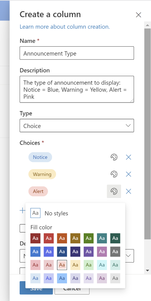
Press “+ Add column,” then choose “Choice.”
Enter and/or choose the following values for the column:
- Name: Announcement Type
- Description: The type of announcement to display: Notice = Blue, Warning = Yellow, Alert = Pink
- Type: Choice
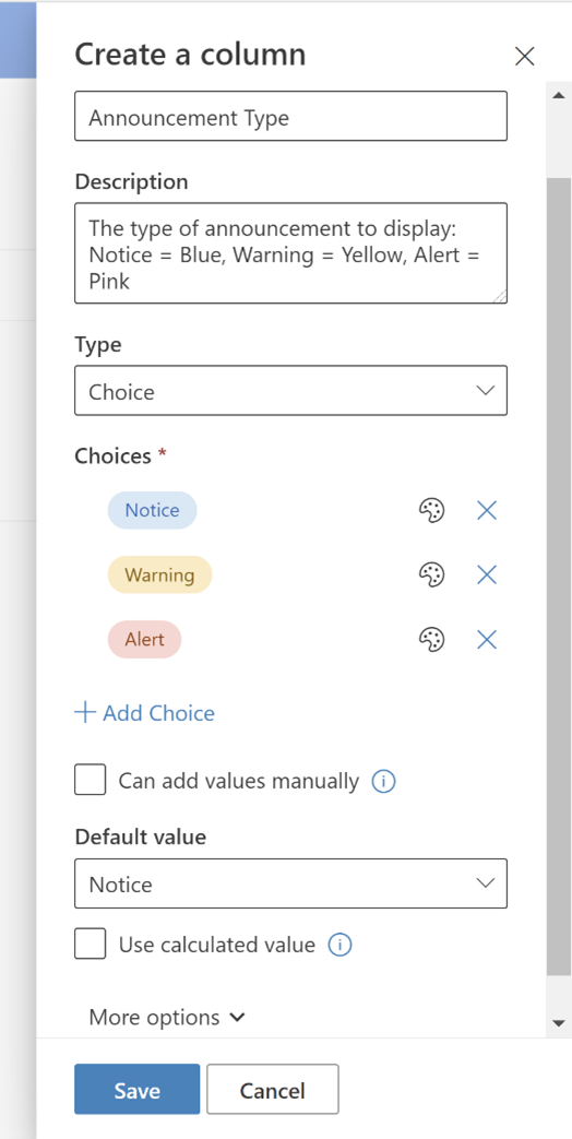
For the Choices section, edit the existing three choices to be:
- Notice
- Warning
- Alert
Change the color of the “Warning” choice by pressing the palette icon and choosing the “Gold” color.
Change the color of the “Alert” choice by pressing the palette icon and choosing the “Peach” color.
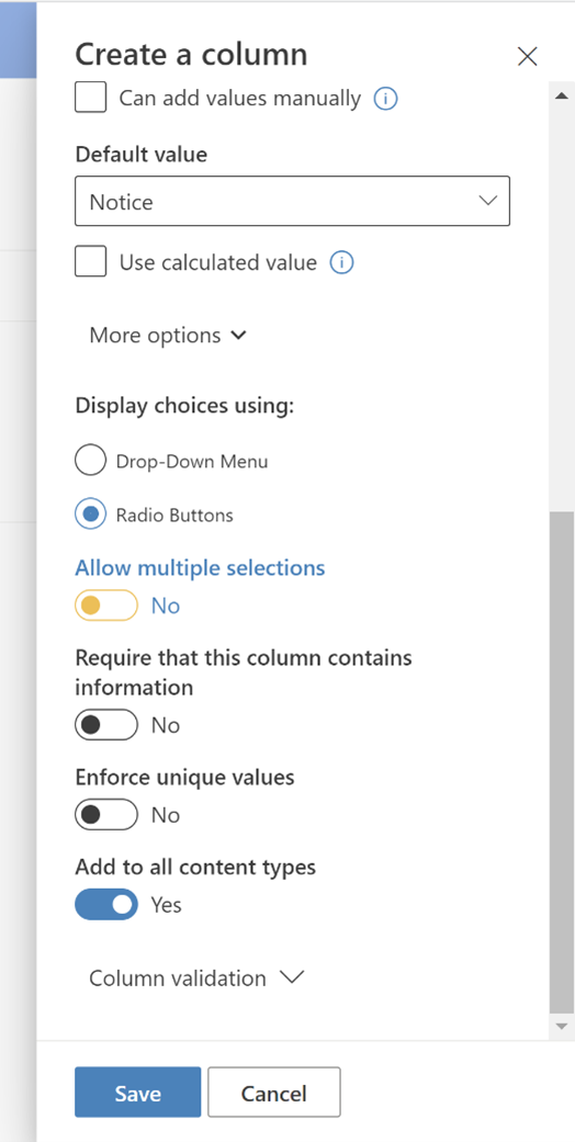
Select “Notice” to be the Default value, then press “More options” to make further adjustments to the column.
Choose the following options for the column, then press “Save” to create it.
- Display choices using: Radio Buttons
- Allow multiple selections: No
- Require that this column contains information: No
- Enforce unique values: No
- Add to all content types: Yes
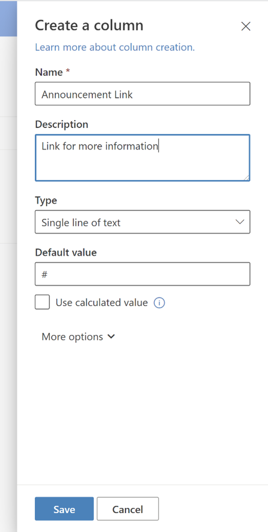
The last column to add should be a link if the announcement has more information that the user needs to reference.
Press “+ Add column,” then choose “Single line of text.” Enter and/or choose the following values for the column, then press the “Save” button to create the new column:
- Name: Announcement Link
- Description: Link for more information
- Type: Single line of text
- Default value: #
The Announcements list should now have all the columns needed:
- Title
- Start Date
- End Date
- Announcement Type
- Announcement Link
Custom View for Announcements List
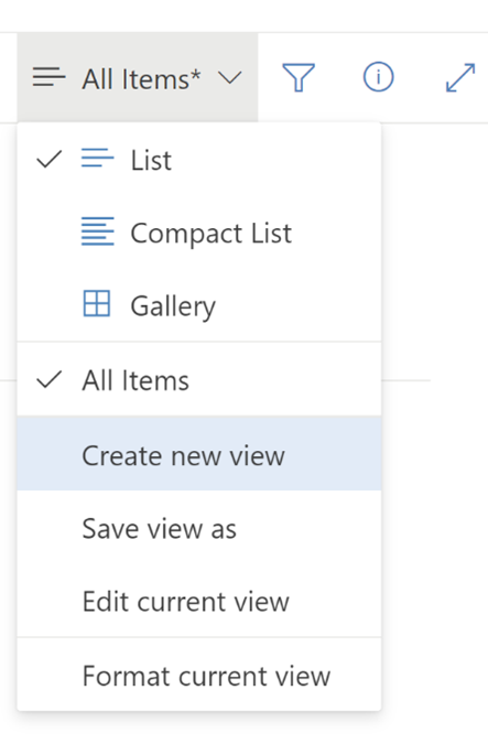
Next, a custom view of the Announcements list should be created to display current announcements.
On the right side of the list menu bar, press the “All Items” button, then choose “Create new view”.
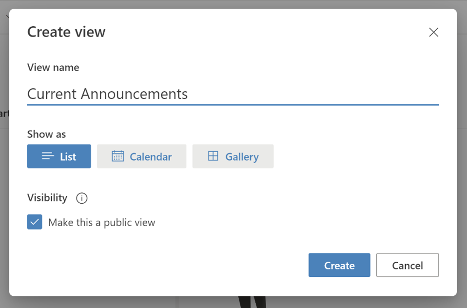
In the dialog, enter “Current Announcements” for the View name, keep “Make this a public view” checked, then press “Create.”
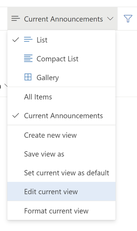
It should redirect to the Current Announcements list view. On the right side of the list menu bar, press the “Current Announcements” button, then choose “Edit current view.”
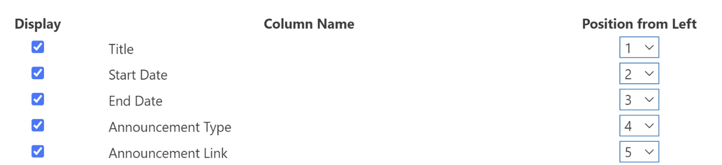
In the “Columns” section, make sure the following columns are checked, to include them in the view:
- Title
- Start Date
- End Date
- Announcement Type
- Announcement Link
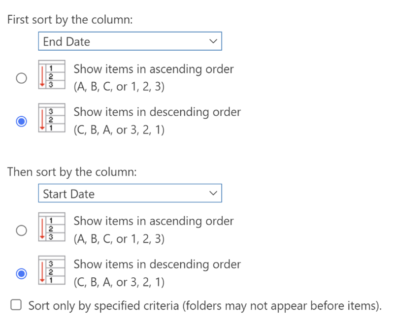
In the “Sort” section, set the first sort to “End Date” and “Show items in descending order,” then set the second sort to “Start Date” and “Show items in descending order.”
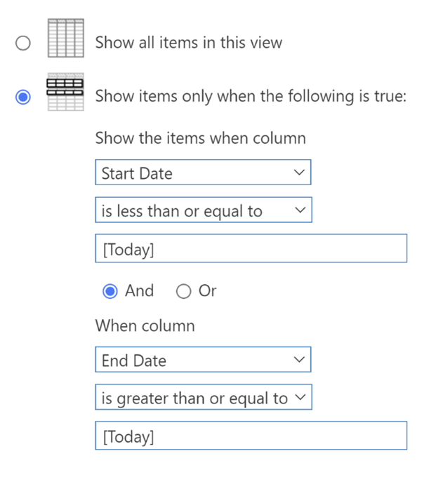
In the “Filter” section, set the filter to show items when “Start Date” is less than or equal to “[Today]” AND when “End Date” is greater than or equal to “[Today].”
Scroll down and press the “OK” button to finish editing the view.
Custom View Formatting
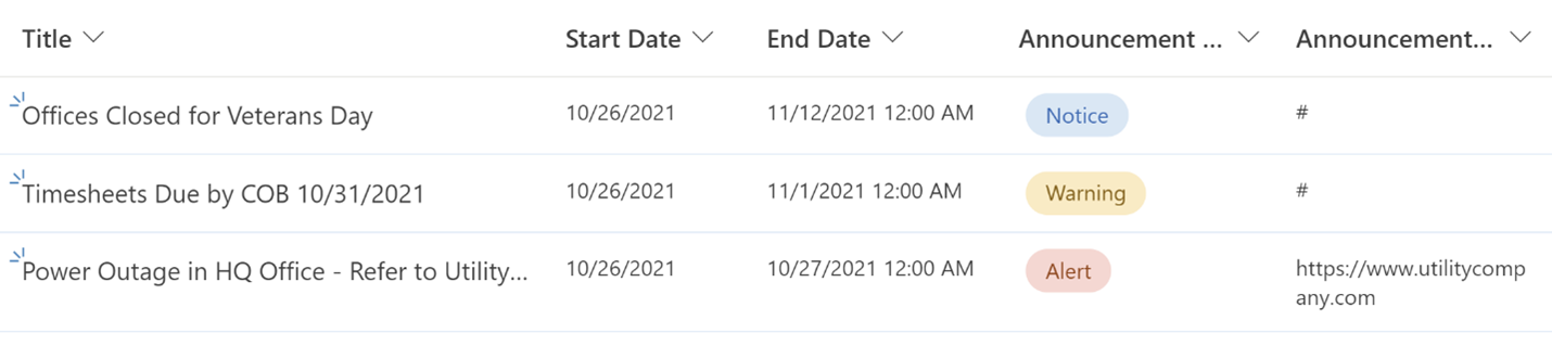
Before applying some custom formatting to the view, enter a few items into the list for testing purposes.
To see the items in the view, make sure that for each item, the “Start Date” is less than or equal to today’s date, and the “End Date” is greater than or equal to today’s date. Then, choose at least one of each “Announcement Type” to see how the formatting changes for each type.
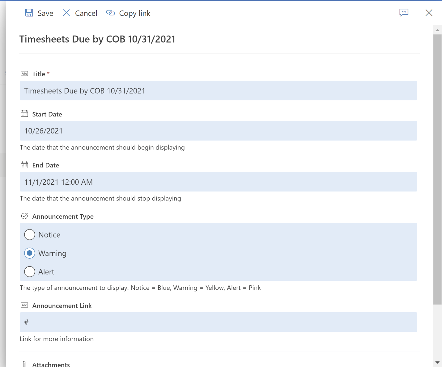
An example is below:
- Title: Timesheets Due by COB 10/31/2021
- Start Date: 10/26/2021
- End Date: 11/1/2021 12:00 AM
- Announcement Type: Warning
- Announcement Link: #
If the announcement banner should link to somewhere else, enter a full URL into the “Announcement Link” field.
After entering a few items into the list, it should look something like this:
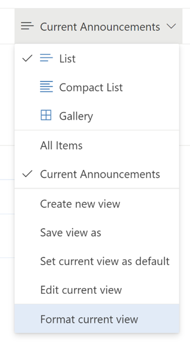
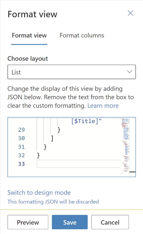
On the right side of the list menu bar, press the “Current Announcements” button, then choose “Format current view.”
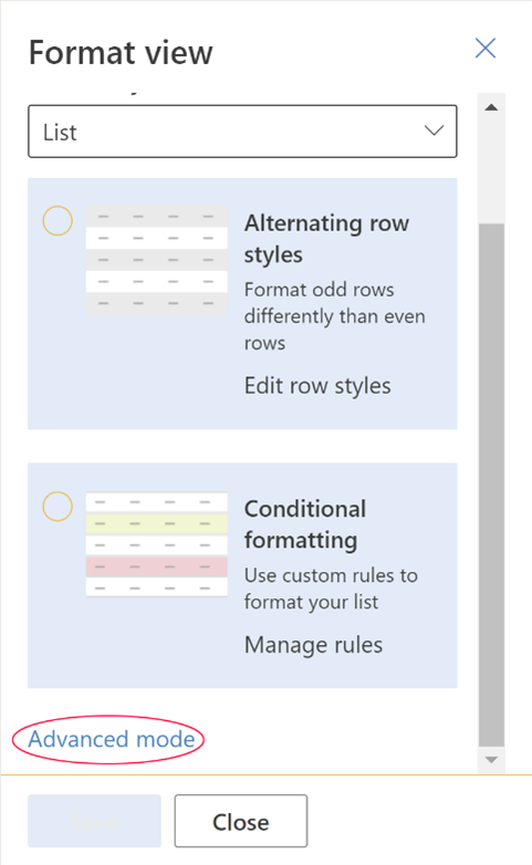
In the sidebar, scroll down and choose “Advanced mode”.
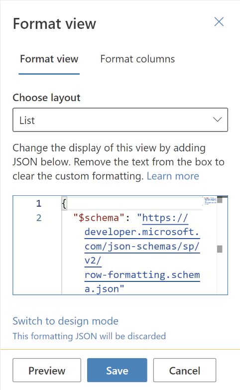
The sidebar will now show an input field that contains JSON code. Copy the code from that field and paste it into a preferred code editor to make it easier to work with.
Microsoft has some great examples of list view formatting. Let’s walk through the formatting for this example.
Since this view will only show a banner, the list headers and the selection options should be hidden, so “hideSelection” and “hideColumnHeader” should be set to true.
Instead of the traditional table elements, we will use the “rowFormatter” to render custom elements per row/item.
In the row formatter, we should first determine what type the element should be, set by the “elmType” property. In this case, we will set it to a “div”.
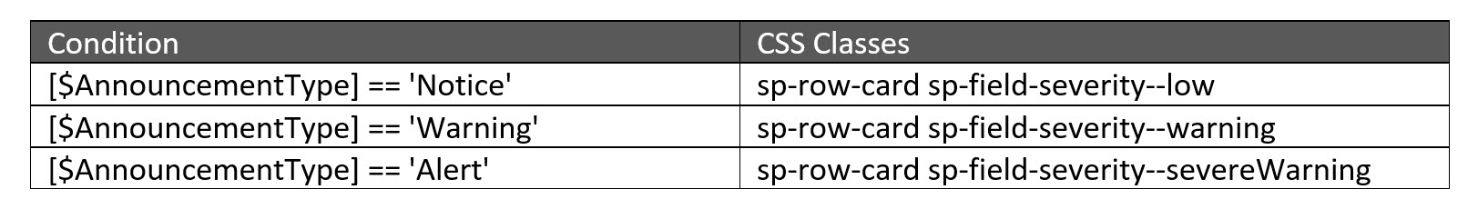
Next, we will apply CSS class attributes to that div element based on certain conditions. There are many predefined CSS class names that SharePoint uses, which we can apply to the div. A few of the common ones are listed in their style guidelines.
The condition we want to check is the value of the “Announcement Type” column. When referencing a list column in JSON, enclose it in “[]” brackets, and prepend it with “$”. (Depending on the name of the column, sometimes spaces may also need to be substituted with “_x0020_”.)
In the code snippet shown, we check the following conditions and apply the appropriate CSS classes to the div based on that condition.
{
  "$schema": "https://developer.microsoft.com/json-schemas/sp/row-formatting.schema.json",
  "hideSelection": true,
  "hideColumnHeader": true,
  "rowFormatter": {
    "elmType": "div",
    "attributes": {
      "class": "=if([$AnnouncementType] == 'Notice', 'sp-row-card sp-field-severity--low', if([$AnnouncementType] == 'Warning', 'sp-row-card sp-field-severity--warning', if([$AnnouncementType] == 'Alert', 'sp-row-card sp-field-severity--severeWarning', '')))"
    },
    "children": [
    ]
  }
}
Next, we will specify how the child elements of the div are rendered. Under the “children” property, we will set up two span elements inside the div: One for the icon and one for the text.
For the span element with the icon, first, we set up an “elmType” of “span”. Then we check the “Announcement Type” column again to reference the name of the icon from the Fluent UI library and apply it to the “iconName” attribute under “attributes.”
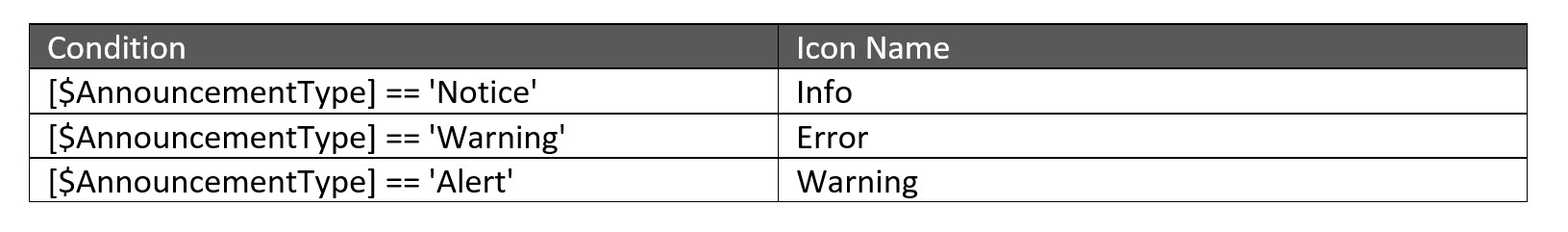
We can also apply specific CSS styles to that span via the “style” property. Here we use custom padding, display, and font-size style attributes.
{
  "$schema": "https://developer.microsoft.com/json-schemas/sp/row-formatting.schema.json",
  "hideSelection": true,
  "hideColumnHeader": true,
  "rowFormatter": {
    "elmType": "div",
    "attributes": {
      "class": "=if([$AnnouncementType] == 'Notice', 'sp-row-card sp-field-severity--low', if([$AnnouncementType] == 'Warning', 'sp-row-card sp-field-severity--warning', if([$AnnouncementType] == 'Alert', 'sp-row-card sp-field-severity--severeWarning', '')))"
    },
    "children": [
      {
        "elmType": "span",
        "attributes": {
          "iconName": "=if([$AnnouncementType] == 'Notice', 'Info', if([$AnnouncementType] == 'Warning', 'Error', if([$AnnouncementType] == 'Alert', 'Warning', '')))"
        },
        "style": {
          "padding-right": "12px",
          "display": "inline-block",
          "font-size": "1.5em"
        }
      }
    ]
  }
}
Next to the span with the icon, we will render another span with the “Title” text for that announcement item. It should be set as an “elmType” of “span.” Custom display and vertical-align styles can be applied with the “style” property. To render the title text, set the “txtContent” property to “[$Title]”.
{
  "$schema": "https://developer.microsoft.com/json-schemas/sp/row-formatting.schema.json",
  "hideSelection": true,
  "hideColumnHeader": true,
  "rowFormatter": {
    "elmType": "div",
    "attributes": {
      "class": "=if([$AnnouncementType] == 'Notice', 'sp-row-card sp-field-severity--low', if([$AnnouncementType] == 'Warning', 'sp-row-card sp-field-severity--warning', if([$AnnouncementType] == 'Alert', 'sp-row-card sp-field-severity--severeWarning', '')))"
    },
    "children": [
      {
        "elmType": "span",
        "attributes": {
          "iconName": "=if([$AnnouncementType] == 'Notice', 'Info', if([$AnnouncementType] == 'Warning', 'Error', if([$AnnouncementType] == 'Alert', 'Warning', '')))"
        },
        "style": {
          "padding-right": "12px",
          "display": "inline-block",
          "font-size": "1.5em"
        }
      },
      {
        "elmType": "span",
        "style": {
          "display": "inline-block",
          "vertical-align": "top"
        },
        "txtContent": "[$Title]"
      }
    ]
  }
}
Select the code above and copy it. Go back to the editor for the custom view formatting ( “Current Announcements” > “Format current view” > “Advanced mode”) and paste the code into the JSON code editor.
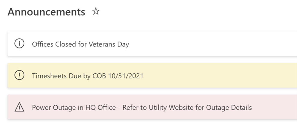
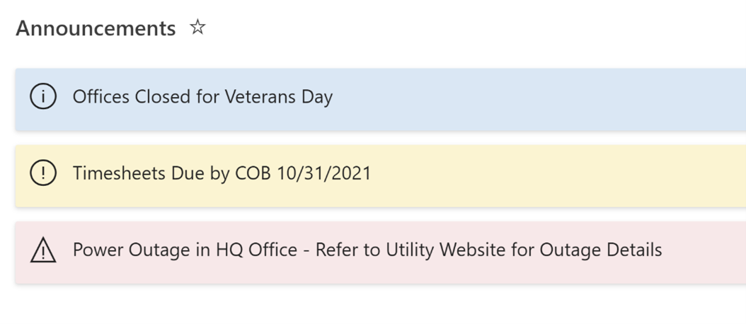
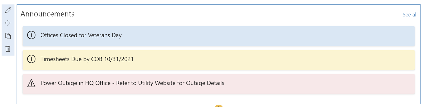
Press the “Save” button, and the “Current Announcements” list view should now look similar to this:
We may want to change the background color for notices to the same color chosen when creating the choices for the column. To do that, change “sp-field-severity–low” in the div’s class attribute to “sp-CSS-backgroundColor-BgCornflowerBlue.” Once that change is made to the code in the custom view formatting and “Save” is pressed again, any “Notice” announcements should now have a light blue background.
This looks great for basic announcements, but what if users need to link to an article or website for more information? To do that, we will need to take the current span children of each row and move them inside an anchor element used for the link.
Create a new “elmType” of “a” as the first object inside the main div’s “children” property. Set the anchor’s “href” attribute to reference the “Announcement Link” column, and apply a condition to set the anchor’s “target” attribute. We want the link to open in a new window if it is not the default “#” value. Next, add custom “style” properties to set the display, text-align, font-size, text-decoration, and color, then add an empty “children” property, where we will move the current icon and text spans.
{
        "elmType": "a",
        "attributes": {
          "target": "=if([$AnnouncementLink]!='#','_blank','_self')",
          "href": "[$AnnouncementLink]"
        },
        "style": {
          "text-align": "left",
          "font-size": "1.3em",
          "text-decoration": "none",
          "color": "#212121",
          "display": "block"
        },
        "children": []
      },
Now move the original child “span” elements into the children of the “a” element. The final code should look like this:
{
  "$schema": "https://developer.microsoft.com/json-schemas/sp/v2/row-formatting.schema.json",
  "hideSelection": true,
  "hideColumnHeader": true,
  "rowFormatter": {
    "elmType": "div",
    "attributes": {
      "class": "=if([$AnnouncementType] == 'Notice', 'sp-row-card sp-CSS-backgroundColor-BgCornflowerBlue', if([$AnnouncementType] == 'Warning', 'sp-row-card sp-field-severity--warning', if([$AnnouncementType] == 'Alert', 'sp-row-card sp-field-severity--severeWarning', '')))"
    },
    "children": [
      {
        "elmType": "a",
        "attributes": {
          "target": "=if([$AnnouncementLink]!='#','_blank','_self')",
          "href": "[$AnnouncementLink]"
        },
        "style": {
          "text-align": "left",
          "font-size": "1.3em",
          "text-decoration": "none",
          "color": "#212121",
          "display": "block"
        },
        "children": [
          {
            "elmType": "span",
            "attributes": {
              "iconName": "=if([$AnnouncementType] == 'Notice', 'Info', if([$AnnouncementType] == 'Warning', 'Error', if([$AnnouncementType] == 'Alert', 'Warning', '')))"
            },
            "style": {
              "padding-right": "12px",
              "display": "inline-block",
              "font-size": "1.5em"
            }
          },
          {
            "elmType": "span",
            "style": {
              "display": "inline-block",
              "vertical-align": "top"
            },
            "txtContent": "[$Title]"
          }
        ]
      }
    ]
  }
}
Paste this updated code into the editor for the custom view formatting ( “Current Announcements”
> “Format current view” > “Advanced mode”), and press the “Save” button once again.
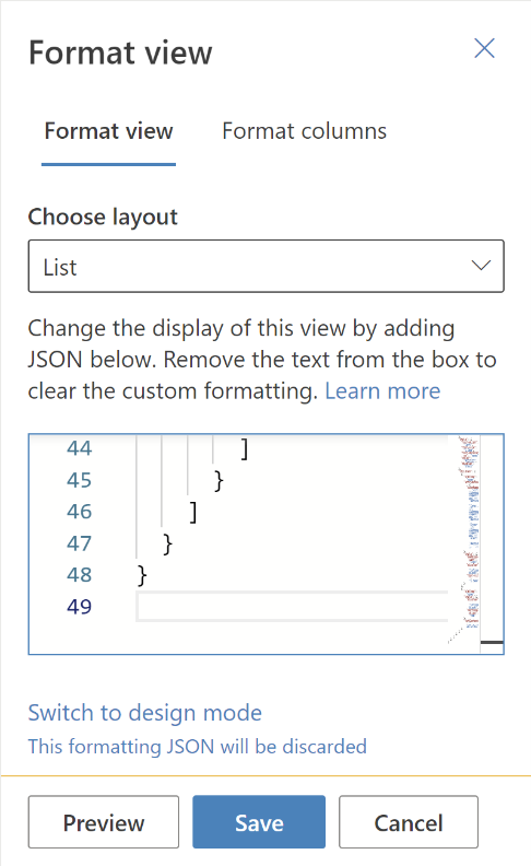
The “Current Announcements” list view should now look similar to this:
Display List View on Home Page
Now that the list view has been formatted as desired, it can be added to the intranet home page.
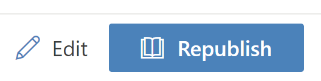
Go to the intranet home page and press the “Edit” button in the toolbar to edit the page.
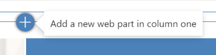
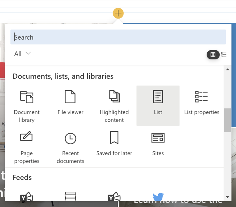
Hover over a prominent area on the page where the announcements should go, then press the “+” button to add a new web part there.
Scroll down to the “Documents, lists, and libraries” section in the menu and choose the “List” web part.
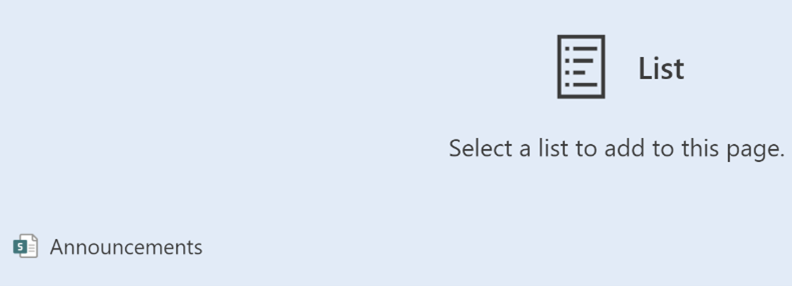
When the web part is added to the page, it will prompt for which list to select. Choose the “Announcements” list.
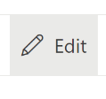
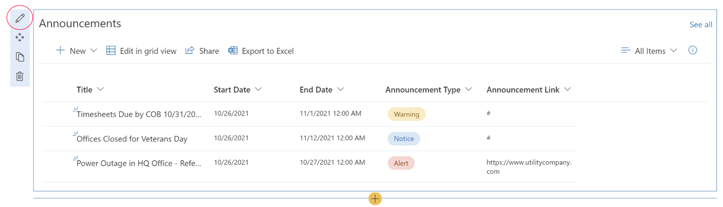
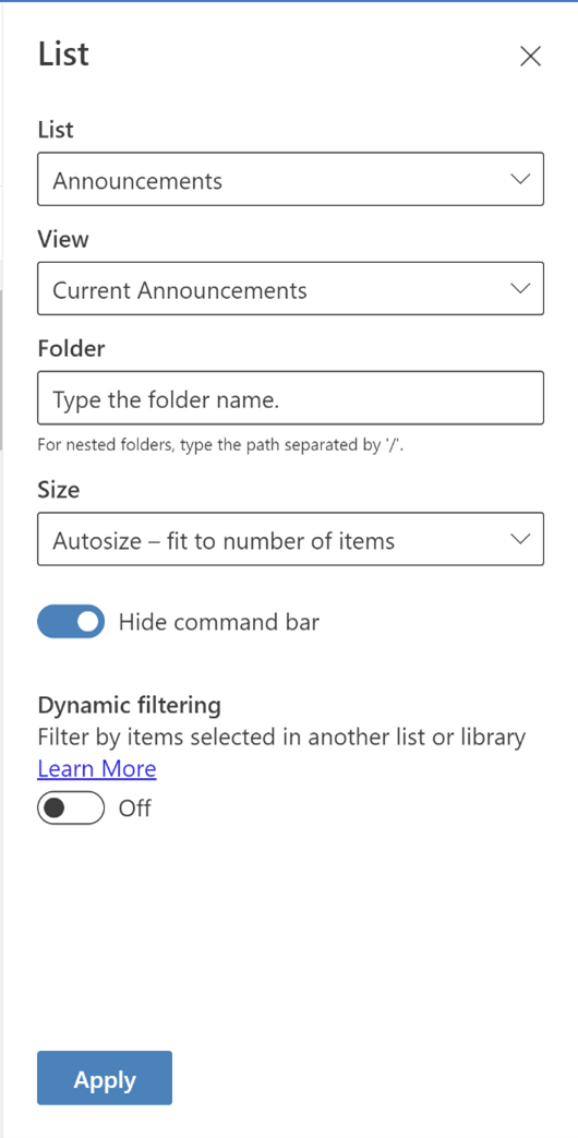
By default, the List web part displays the All Items list view. Hover over the pencil icon next to the web part to edit its properties.
In the slide-in panel, select the “Current Announcements” view, toggle the switch to the “Hide command bar,” then press the “Apply” button.
The List web part should now display the formatted “Current Announcements” view without additional list command bar controls.
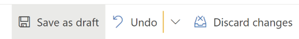
In the page toolbar, press the “Save as draft” button to save the updates, then press “Republish” to publish the new version of the home page.
Now important company announcements are displayed on the intranet home page in a prominent location.
Conclusion
This is just one example of how a low-code solution with relatively little effort can be implemented to satisfy the need for a custom feature not natively provided by SharePoint.
For additional resources and other examples, refer to Microsoft’s documentation on list formatting.
AIS has tons of experience helping companies build useful intranets. Contact us to see how we can help.