


Change Data Views from Boring to Flashy
Data, data, data… Working professionals are inundated with data. Anything that makes that data easier to understand, analyze, and compare is a welcome breath of fresh air. Why snooze over a boring and static table when you can view key metrics at-a-glance in a snazzy chart?
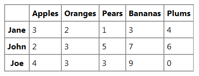
Many SharePoint sites are used for managing internal business processes where users store and analyze data. SharePoint 2013 makes it easy to store data in lists, and view that data in a team site, but usually that data is shown in a basic table view.
With some basic customization, we can take a boring table view and turn it into an eye-catching chart by utilizing a charting library to interpret and display that data. One possibility is Highcharts – A popular Javascript-based library of robust charting tools with a flashy appeal. For this exercise, we will demonstrate Highcharts integration, but the steps would be similar for other charting libraries.
Prep Work / Assumptions
Upload the requisite charting library file(s) and the jQuery library file to the Style Library in your SharePoint site. (You may want to have a separate folder for these.) The data for your chart should be stored in a list in your site.
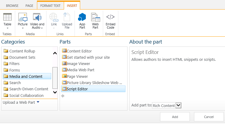
Custom scripts will be written to access and render the data. For this demonstration, we will place the scripts in a Script Editor Web Part, and the chart container in a Content Editor Web Part, but this code could also be written in a custom web part.
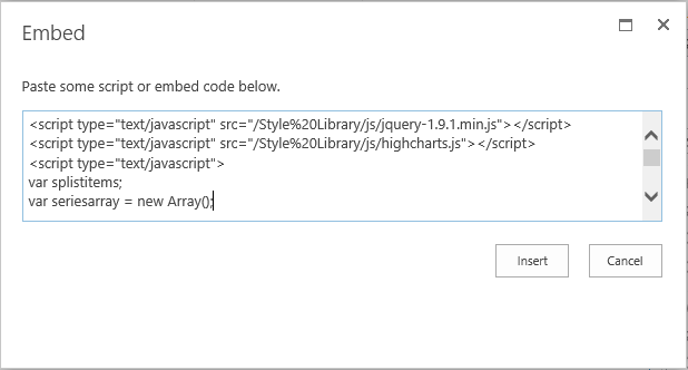
To start, add the script references to the charting library file(s) and the jQuery library file. Make sure that the references to these files are relative to the location of the page that you want the chart displayed on.
<script type="text/javascript" src="/Style%20Library/js/jquery-1.9.1.min.js"></script>
<script type="text/javascript" src="/Style%20Library/js/highcharts.js"></script>
Get the Data
First you will need to get the data from the SharePoint list. Let’s break down some example code to do that.
First open your script tag. Set up the variables to store your list items from SharePoint and the data array to use in the charting function. Make sure your function for getting the data is called after the SharePoint sp.js file by using ExecuteOrDelayUntilScriptLoaded.
<script type="text/javascript">
var splistitems;
var seriesarray = new Array();

ExecuteOrDelayUntilScriptLoaded(GetChartData, "sp.js");
Use the Javascript client object model to retrieve and load your list item data (see MSDN for more information regarding this).
function GetChartData() {
seriesarray = [];
var currentcontext = new SP.ClientContext.get_current();
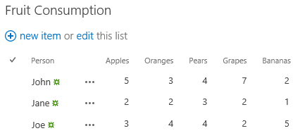
var splist = currentcontext.get_web().get_lists().getByTitle('Fruit Consumption');
var splistquery = new SP.CamlQuery();
splistitems = splist.getItems(splistquery);
currentcontext.load(splistitems);
currentcontext.executeQueryAsync(Function.createDelegate(this, GetChartDataSuccess), Function.createDelegate(this, GetChartDataFail));
}
Once your query is successfully executed, build out the data arrays to use for your charts. Make sure that you are using the internal column/field name in the get_item function. After you have enumerated through the list items and built your data array, call your function to draw the chart.
function GetChartDataSuccess(sender, args) {
   var splistitemcount = splistitems.get_count();
   if (splistitemcount != 0) {
      var splistitemenumerator = splistitems.getEnumerator();
      while (splistitemenumerator.moveNext()) {
         var currentlistitem = splistitemenumerator.get_current();
         var itemname = currentlistitem.get_item("Title");
         var itemapples = currentlistitem.get_item("Apples");
         var itemoranges = currentlistitem.get_item("Oranges");
         var itempears = currentlistitem.get_item("Pears");
         var itemgrapes = currentlistitem.get_item("Grapes");
         var itembananas = currentlistitem.get_item("Bananas");
         var seriesitem = {
                           name: itemname,
                           data: [ itemapples, itemoranges, itempears, itemgrapes, itembananas ]
                       };
         seriesarray.push(seriesitem);
      }
      DrawChart();
   }
}
Make sure you also provide a function to display errors in case your query fails.
function GetChartDataFail(sender, args) {
   alert('Request failed. ' + args.get_message() + '\n' + args.get_stackTrace());
}
Set up the Chart Rendering
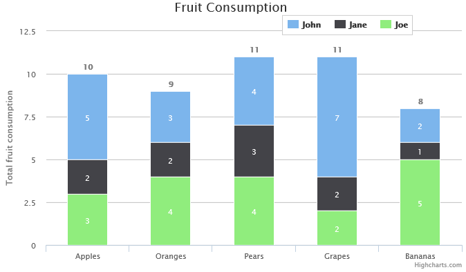
Next you will need to set up the scripts to render the chart. We will use a basic stacked column chart for this exercise, but Highcharts provides a variety of other chart types that could be used instead (line, area, pie, etc.). In your function to draw out the chart, reference the Highcharts demos and API for guidance. In this example, the code is very similar to the stacked column demo. Instead of drawing the chart on document ready, we set up the chart in a function, so that we can wait until the data is loaded from SharePoint. The chart will be rendered in a named div container, so make a note of what the div’s ID will be (in this example it is “chart-container”). Use your data array variable that you built for the series (in this example it is “seriesarray”).
function DrawChart() {
        fruitChart = new Highcharts.Chart({
            chart: {
                renderTo: 'chart-container',
                type: 'column'
            },
            title: {
                text: 'Fruit Consumption'
            },
            xAxis: {
                categories: ['Apples', 'Oranges', 'Pears', 'Grapes', 'Bananas']
            },
            yAxis: {
                min: 0,
                title: {
                    text: 'Total fruit consumption'
                },
                stackLabels: {
                    enabled: true,
                    style: {
                        fontWeight: 'bold',
                        color: 'gray'
                    }
                }
            },
            legend: {
                align: 'right',
                x: -70,
                verticalAlign: 'top',
                y: 20,
                floating: true,
                backgroundColor: 'white',
                borderColor: '#CCC',
                borderWidth: 1,
                shadow: false
            },
            tooltip: {
                formatter: function() {
                    return '<b>'+ this.x +'</b><br/>'+
                        this.series.name +': '+ this.y +'<br/>'+
                        'Total: '+ this.point.stackTotal;
                }
            },
            plotOptions: {
                column: {
                    stacking: 'normal',
                    dataLabels: {
                        enabled: true,
                        color: 'white',
                        style: {
                            textShadow: '0 0 3px black, 0 0 3px black'
                        }
                    }
                }
            },
            series: seriesarray
        });
    }
Finish by closing your script tag.
</script>
Add Code to the Page
Edit your page and add a Content Editor Web Part (CEWP) to the area where you want your chart rendered.
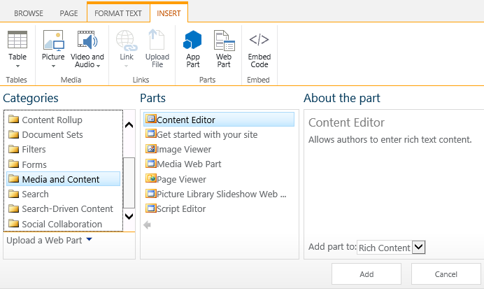
Edit the CEWP, place your cursor in the “Click here to add new content” text, and click the “Edit Source” button in the ribbon. Type in the html for your div container, using the ID that is referenced in your chart rendering function, then click OK. Save the CEWP by clicking OK when you are done.
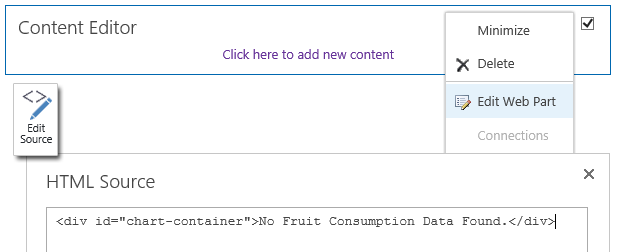
<div id="chart-container">No Fruit Consumption Data Found.</div>
Add a Script Editor Web Part to the page. Click on “EDIT SNIPPET”, paste in all the script code you have prepared, and click Insert. Save the Script Editor Web Part by clicking OK when you are finished.

Save your changes to the page.
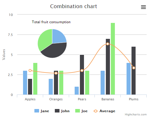
Voilà! – An Eye-Catching Chart
And just like that, you have a stylish chart of your data!
Additional Options
We demonstrated a basic example of how to transform your SharePoint list data into a chart. Consider additional development to fit your needs:
- Error checking and validation could be added, as well as any custom calculations relevant to your data.
- These scripts could be developed into a custom web part or solution that gets deployed to your site.
- Try other chart types (line, area, pie, etc.) if it makes more sense for your particular dataset.