


Prototyping in Axure vs. Power Apps
As I described in part one of this blog series, prototyping was an integral step of our user-centered design/discovery process. When we first started on the project, the UX Architect and I used Axure, a well-known prototyping tool familiar to us. However, as the project progressed, we moved into prototyping in Power Apps directly.
Several reasons led to such change:
- Our client’s security policy required that we keep the prototypes in their tenant.
- Axure is a third-party tool.
- When developers built the new solution in Power Apps, they could not reuse any Axure elements, such as the interaction that we built with Axure’s dynamic panels. While they could inspect the Axure prototype about spacing, color, or padding, they had to re-create all design elements in Power Apps.
- Some Axure controls or design elements were difficult to replicate in Power Apps due to formatting and accessibility limitations, which created inconsistencies between the prototype that stakeholders saw and the final solution.
- Using Axure also incurred an additional licensing cost.
The table below lists some pros and cons between Axure and Power Apps.
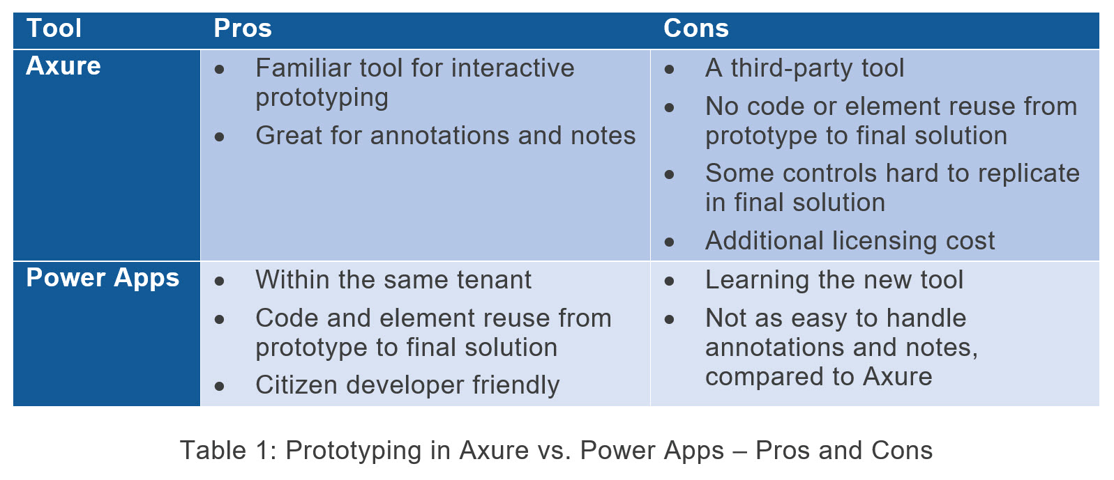
As shown in the table above, prototyping in Power Apps presented significant advantages over Axure. Not only were we able to keep all content within the same tenant, but also our Developers could reuse some prototype code and design elements when they started development, such as directly copying form controls and functions from the prototype.
In addition, as the time of writing this blog, the project team has been developing a Power Apps Component Library, with the consistent design of form elements, which will further streamline code and element reuse in the future. In addition, the project team has been mentoring client employees from several business units in their InfoPath form from the modernization process. The Component Library will serve as a great tool to help these people, who may not have any UX or user interface design knowledge, follow UX design best practices.
Prototyping in Power Apps did pose some challenges because it always takes time to learn something new. However, I was very motivated and started to prototype in Power Apps as soon as I had the opportunity. I saw how our Developers quickly added, removed, or modified form elements when we worked together on some app requirements. I also had a glimpse of the Power Platform capabilities when I attended a workshop two years ago and knew it was citizen developer-friendly. (See my previous blog: Microsoft Business Applications: A UX Researcher’s Perspective).
My prototyping experience in Power Apps proved to be very positive, and I felt empowered by the Power Platform. Here’s why:
- I received a lot of help from my Developer colleagues, especially Stephanie Zaloga (LinkedIn). She created a template for me based on a canvas app she developed, which included many frequently used form elements and controls, pre-formatted with the appropriate fill, border color, hover, and font variations. I could easily reuse them in my prototype without having to go through the tedious formatting process. (The Component Library in development will further help.)
- I focused on improving form instructions, labels, and controls, based on form design and plain language writing best practices, which I was familiar and comfortable with.
- I was able to prototype cascading data fields and simple interactions, usually crucial to meet client’s business needs, with just a few essential functions in Power Apps, such as Switch or If. During development, our Developers could copy and paste these correctly formatted controls, such as dropdown fields, text inputs, and HTML text/instructions, directly to the final solution, which sped up their overall app development time.
- I did not create any back-end data for my prototype, which would require more Developer skills.
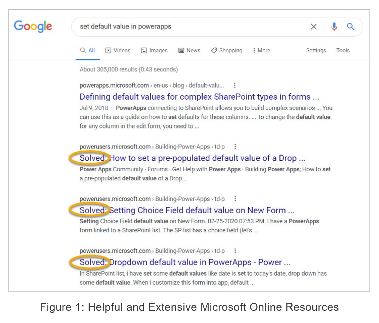
- I found Microsoft’s online resources and support from the Power Apps community extremely helpful. It was comforting to start a search and see results highlighting a particular problem solved.
Form Design and Content Development Best Practices
When I prototyped the new solution based on the existing InfoPath forms, I always considered form design best practices and tried to improve form usability whenever possible. When we met with stakeholders to get their approval of the prototype and requirements, we would point out such improvements in the prototype, making sure that they were aware and comfortable with our recommendations.
Some of the form design best practices that we implemented included:
- Follow digital content development best practices for instructions and labels
- Rewrite content to be more usable and accessible, including removing all those Click Here or Here standalone links
- Shorten or eliminate form instructions whenever possible
- Use numbered lists for sequential steps and bulleted lists to support user scan, instead of long paragraphs
- Spell out acronyms when they are used the very first time
- Consistently use words and phrases and eliminate inconsistencies, such as up-grade vs. upgrade
- Create new form sections with clear section labels, if needed, and logically group similar questions together
- Ensure a clear visual distinction between primary and secondary action buttons, such as Save and Go Back, and align primary actions with input fields/user flow
- Never use colors alone to convey information to meet accessibility guidelines
Dropdown lists were common form components. For app consistency, at the beginning of the project, our team agreed that:
- Higher numbers or more favorable options should be placed at the top of all options instead of the bottom. This is to support natural conceptual mapping. For example: With dropdown options showing risk, we would display the options as:
- 5 – High Risk (on the top)
- 4 – Medium to High Risk
- 3 – Medium Risk
- 2 – Low Risk
- 1 – No Risk (at the bottom)
- Options should be displayed in a certain order: alphabetically or by priority/frequency.
- Radio buttons should be used for two to three options instead of a dropdown.
- Radio buttons should always have a default value when used.
- The default value will be displayed first.
Project Updates and More Information
Our project that lasted from August 2020 to this February was a success, which led to two additional projects starting within the same insurance company. Since February, I have been working in a project team that requires Microsoft Dataverse and model-driven apps to modernize InfoPath forms related to an important product. In this project, I function as a BA, UX Researcher, and Organizational Change Manager. This has presented exciting new learning opportunities, as well as challenges. I may write another blog post depicting my experience afterward.
To learn more:
