


Progressive Web Apps (PWAs)
As an introduction to PWAs, let’s build a mobile app the fastest, easiest way, using the Progressive Web App model. A PWA is both a mobile app and a website. Built with HTML, CSS, and javascript, the website can be viewed as either a website on your laptop or a mobile app on your phone or tablet. No need to develop a separate native app for every platform!
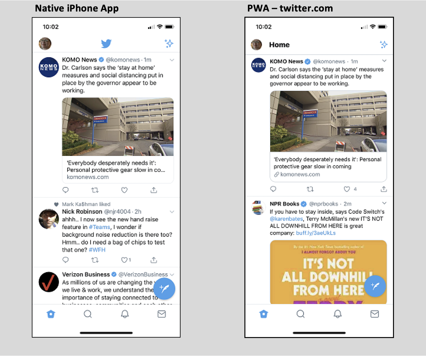
What does “App-like” mean? PWAs can work on your phone or tablet so much like a native app, it is hard to see the difference. Twitter produces both, a native app you can find in your app store, and a PWA you can “install” from browsing to twitter.com. Check out images of each:
A PWA can even access device hardware like the camera or microphone! They can produce push notifications and work offline. How does it do these things? It’s all in the site javascript and structure. It is the best way to build a mobile app. Let’s see how this works.
PWA Goals
To work like a native app, the PWA website has to:
- Work offline
- Perform fast
- A display like a native app, responsive, with no browser UI visible
- Startup from an icon on your home screen
Advantages
Why and when would we want to create a PWA?
- Fast deployment: Avoids submission to the app stores for review and approval
- Quicker updates are published immediately because it is served on the web and so no need to wait for the user to download to their device
- More discoverable: Users can find and link to it via search engines
- Secure: They use the browser security model, so providing the security of operating within the web browser context
- Connectivity independent: PWAs can function on very low bandwidth or no connection at all.
- Installable: Like a mobile app, this is opened from an icon on the home screen.
- Notifications: Can send push notifications to the device like a native app
- Hardware access: Can use the mobile device camera, microphone, etc.
Progressive?
“Progressive” in the name refers to that it will work and display in all browsers to a varying degree. Because it is browser dependent, it is affected by the capability of which browser the user has, and what version. PWAs have a goal to display and function at least minimally in all browsers, regardless of version. As such they become progressively more feature-rich in newer versions.
History
The Progressive Web App concept was created by Google in 2015. Its roots go even further back though, to Steve Jobs’ introduction of the iPhone in 2007. He declared back then that development for the iPhone would be done in html5 and have no SDK. His vision was undermined by iPhone jailbreaking which forced Apple to retreat to having an SDK and app store. But the concept lived on and is seeing increasing life in the PWA model.
Let’s Build One
We will look at how to use a manifest and service worker to create a very simple application that provides the features of a PWA. This is exciting to see on your phone, in action!
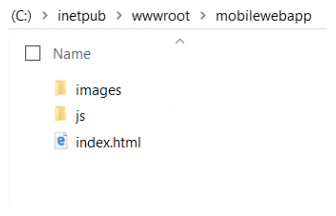
In your development environment, create a folder in your local for your project, name it anything, and add subfolders for js and images, and an index.html file:
This demo was edited VS Code and the site was served on IIS in Windows but any favorite editor and dev web server will be fine. Node.js http-server is another easily available web server you could use. The file index.html should look like this, to start. We’ll add more later:
<!doctype html>
<html lang="en">
<head>
  <meta charset="utf-8">
  <title>Hello My Phone</title>
  <meta name="viewport" content="width=device-width, initial-scale=1.0">
</head>
<body class="fullscreen">
  <div class="container">
    <h1 class="title">Hello My Phone!</h1>
  </div>
</body>
</html>
Run the app now in your webserver to see how it is shaping up. So far this is just a web app. Push it to your GitHub Pages repo to see it run on the web. To add mobile app functionality, we need to add two files, a Service Worker and a manifest.
Service Worker and Manifest
These change the app from a simple web app to one that can behave like a mobile app, a Progressive Web App. The Service Worker is the middleman between the web page and content. It contains the code to determine whether to deliver static, cached content or dynamic data based on whatever criteria you want, typically whether it finds a connection to the internet or not. The manifest is a json file that provides properties to the browser such as which page to load when the app is first opened, or what is the title of the app. Both the manifest and the service worker live on the root directory for access.
Create a file named manifest.json in the root of the site, and add the following:
{
  "name": "My Phone App",
  "short_name": "My App",
  "icons": [{
    "src": "images/phoneapp-icon-128.png",
      "sizes": "128x128",
      "type": "image/png"
    }, {
      "src": "images/phoneapp-icon-144.png",
      "sizes": "144x144",
      "type": "image/png"
    }, {
      "src": "images/phoneapp-icon-152.png",
      "sizes": "152x152",
      "type": "image/png"
    }, {
      "src": "images/phoneapp-icon-192.png",
      "sizes": "192x192",
      "type": "image/png"
    }, {
      "src": "images/phoneapp-icon-256.png",
      "sizes": "256x256",
      "type": "image/png"
    }, {
      "src": "images/phoneapp-icon-512.png",
      "sizes": "512x512",
      "type": "image/png"
    }],
  "description": "Sample Progressive Web App",
  "lang": "en-US",
  "start_url": "index.html",
  "display": "standalone",
  "background_color": "white",
  "orientation": "any",
  "theme_color": "white"
}
Link the manifest file in your index.html file, in the head section:
<link rel="manifest" href="/manifest.json">
Service Worker
To add the service worker, create a file in the root folder named sw.js. Add the following to it:
var cacheName = 'phoneApp';
var filesToCache = [
  './',
  './index.html',
  './css/style.css',
  './js/main.js'
];

/* Start the service worker and cache files in filesToCache */
self.addEventListener('install', function(e) {
  e.waitUntil(
    caches.open(cacheName).then(function(cache) {
      return cache.addAll(filesToCache);
    })
  );
});

/* Serve cached content when offline */
self.addEventListener('fetch', function(e) {
  e.respondWith(
    caches.match(e.request).then(function(response) {
      return response || fetch(e.request);
    })
  );
});
Adding a service worker is the first step towards enabling the following progressive web app features:
- Offline performance
- Push notifications
- Add icon to the home screen
Our service worker file caches specifically named pages to be able to serve them from the cache when the device is offline. The file must be placed in the app root to allow it access to all of the app’s files. Service workers only have permission to access files in their same-level directory and subfolder. In the first function of the sw.js, the first item in the variable filesToCache is “./” because that allows caching of our index.html. The cacheName variable adds the content to the browser cache to be available to be called from the javascript. The following function fetches the cached content. This file works for our demo but to properly fortify the app with error handling and to see what else the service worker can do, check out PWABuilder. It is a handy file generator for your PWA, but even if you don’t use the generator, just looking at this site sums nicely what you can define in the manifest and service worker and what they can do. For now, we’ll keep our service worker simple.
Register the Service Worker
We need one more file to call, or “register”, the service worker. Create a javascript file in your js folder named main.js. This tells the browser where to find your service worker JavaScript file. Add the following:
window.onload = () => {
‘use strict’;
if (‘serviceWorker’ in navigator) {
navigator.serviceWorker
.register(‘./sw.js’);
}
}
Link to main.js at the bottom of index.html by adding a script link before the closing body tag:
<script src="js/main.js"></script>
App Icons
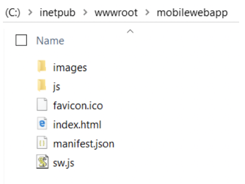
We need to provide icons that various displays can use, to support the mobile app experience of having an app icon on the device. Images of varying sizes are defined in the manifest above. We will put these images in the Images folder to be available to display the home screen icon when users “install” your app. Sample images for these and for favicon.ico are included in the downloadable files (link below). The file structure looks like this now:
Add Responsive HTML
To see the best effect of your sites’ web vs mobile view, add some responsive elements and styles to index.html. This example uses the free W3 Schools templates. It links to their online w3.css stylesheet for responsive styles. A link to the W3 Schools templates is included in the links at the end of this post along with a link to download the project files.
With the addition of the html below, our site now has navigation and layout that changes based on the viewport. The HTML now looks like this:
<!doctype html>
<html lang="en">
<head>
  <meta charset="utf-8">
  <title>PWA Sample</title>
  <link rel="manifest" href="manifest.json">
  <link rel="stylesheet" href="css/style.css"> <!-- optional -->
  <link rel="stylesheet" href="https://www.w3schools.com/w3css/4/w3.css">
  <meta name="viewport" content="width=device-width, initial-scale=1.0">
  <meta name="theme-color" content="white"/>
  <link rel="icon" href="favicon.ico" type="image/x-icon" />
<link rel="apple-touch-icon" href="images/pwa-icon-152.jpg">
<meta name="theme-color" content="white"/>
<meta name="apple-mobile-web-app-capable" content="yes">
<meta name="apple-mobile-web-app-status-bar-style" content="black">
<meta name="apple-mobile-web-app-title" content="Hello World">
<meta name="msapplication-TileImage" content="images/pwa-icon-144.jpg">
<meta name="msapplication-TileColor" content="#FFFFFF">
</head>
<body class="fullscreen">
<!-- Sidebar/menu -->
<nav class="w3-sidebar w3-collapse w3-top w3-large w3-padding" style="z-index:3;width:300px;font-weight:bold; background-color:#ddd;" id="mySidebar">
  <a href="javascript:void(0)" onclick="w3_close()" class="w3-button w3-hide-large w3-display-topleft" style="width:100%;font-size:22px">Close Menu</a>
<div class="w3-container">
<div style="width: 120px; height:119px; background-color: #fff;">
  <img src="images/logo.jpg"</div>
</div>
<div class="w3-bar-block">
    <a href="#" onclick="w3_close()" class="w3-bar-item w3-button w3-hover-white">Home</a>
    <a href="#sectionOne" onclick="w3_close()" class="w3-bar-item w3-button w3-hover-white">Section One</a>
    <a href="#sectionTwo" onclick="w3_close()" class="w3-bar-item w3-button w3-hover-white">Section Two</a>
    <a href="#simpleForm" onclick="w3_close()" class="w3-bar-item w3-button w3-hover-white">Contact</a>
  </div>
</nav>
<!-- Top menu on small screens -->
<header class="w3-container w3-top w3-hide-large w3-grey w3-xlarge w3-padding">
  <a href="javascript:void(0)" class="w3-button w3-grey w3-margin-right" onclick="w3_open()">☰</a>
  <span>My Mobile App</span>
</header>

<!-- Overlay effect when opening sidebar on small screens -->
<div class="w3-overlay w3-hide-large" onclick="w3_close()" style="cursor:pointer" title="close side menu" id="myOverlay"></div>
<!-- !PAGE CONTENT! -->
<div class="w3-main" style="margin-left:340px;margin-right:40px">
<!-- Header -->
  <div class="w3-container" id="showcase">
   <h1 class="w3-xxlarge">My Mobile App</h1>
   <h1 class="w3-large w3-text-gray"><b>Lorem dolor etc!</b></h1>
  </div>
<!-- Photo grid (modal) -->
<div class="w3-row-padding">
<div class="w3-half">
      <img src="images/circle1.jpg" style="width:100%" onclick="onClick(this)" alt="It's a photo">
      <img src="images/circle4.jpg" style="width:100%" onclick="onClick(this)" alt="It's a photo">
  </div>
<div class="w3-half">
      <img src="images/circle3.jpg" style="width:100%" onclick="onClick(this)" alt="It's a photo">
      <img src="images/circle2.jpg" style="width:100%" onclick="onClick(this)" alt="It's a photo">
  </div>
</div>
  <!-- Top Section -->
<div class="w3-container" id="sectionOne">
<h1 class="w3-large w3-text-gray"><b>Section One</b></h1>
  Ut enim ad minim veniam, quis nostrud exercitation ullamco laboris nisi ut aliquip ex ea commodo consequat. Duis aute irure dolor in reprehenderit in voluptate velit esse cillum dolore eu fugiat nulla pariatur.
</div>
<!-- Section of Text -->
<div class="w3-container" id="sectionTwo">
<h1 class="w3-large w3-text-grey"><b>Section Two</b></h1>
 Excepteur sint occaecat cupidatat non proident, sunt in culpa qui officia deserunt mollit anim id est laborum.
<b>All The Things:</b>
  </div>
  <!-- Images in Boxes -->
<div class="w3-row-padding w3-grayscale">
  <div class="w3-col m4 w3-margin-bottom">
   <div class="w3-light-grey">
     <div class="w3-container">
        <h3>Thing 1</h3>Thing 1 Phasellus eget enim eu lectus faucibus vestibulum. Suspendisse sodales pellentesque elementum.
     </div>
   </div>
</div>
<div class="w3-col m4 w3-margin-bottom">
  <div class="w3-light-grey">
    <div class="w3-container">
       <h3>Thing 2</h3>Thing 2 Phasellus eget enim eu lectus faucibus vestibulum. Suspendisse sodales pellentesque elementum.
    </div>
  </div>
</div>
<div class="w3-col m4 w3-margin-bottom">
   <div class="w3-light-grey">
     <div class="w3-container">
       <h3>Thing 3</h3>Thing 3 Phasellus eget enim eu lectus faucibus vestibulum. Suspendisse sodales pellentesque elementum.
     </div>
    </div>
  </div>
</div>
<div class="w3-container" id="simpleForm" style="margin-top:75px">
My Form
   <form action="/myformaction.js" target="_blank">
     <div class="w3-section">
      <label>Name</label>
      <input class="w3-input w3-border" type="text" name="Name" required>
     </div>
     <div class="w3-section">
       <label>Email</label>
       <input class="w3-input w3-border" type="text" name="Email" required>
     </div>
     <div class="w3-section">
       <label>Message</label>
       <input class="w3-input w3-border" type="text" name="Message" required>
     </div>
     <button type="submit" class="w3-button w3-block w3-padding-large w3-grey w3-margin-bottom">Send Message</button>
   </form>
</div>
<!-- End page content -->
</div>
<script>
// Script to open and close sidebar
function w3_open() {
  document.getElementById("mySidebar").style.display = "block";
  document.getElementById("myOverlay").style.display = "block";
}

function w3_close() {
  document.getElementById("mySidebar").style.display = "none";
  document.getElementById("myOverlay").style.display = "none";
}
</script>
<script src="js/main.js"></script>
</body>
</html>
Install On Your Phone
Upload the files to a WebHost or browse to the localhost IP address in your wifi network, to try it on your phone. On the iPhone, browse to the URL and then choose the share button.

From the context menu, choose “Add to home screen”. Android devices make this even easier by displaying a default button. See links at the end of this post for options to install on Android and other devices.
Summary
Progressive Web Apps offer the best of native mobile apps combined with the advantages of web development. Over time, the increasing embrace of PWA techniques by developers could bring Steve Jobs’ vision for smartphone applications to reality: no need for phone SDKs or and native app deployments or app store constraints, and a world in which web technology can be used to create mobile apps that are faster to build with every bit of functionality equal to their native counterparts.
Links
- Files from this demo project can be downloaded here: http://www.marblenerd.net/mobilewebapp/projectfiles/mobilewebapp.zip
- Demo site: http://www.marblenerd.net/mobilewebapp
- Wikipedia PWAs https://en.wikipedia.org/wiki/Progressive_web_application
- Smashing Magazine A Beginner’s Guide to Progressive Web Apps
- Love2Dev blog https://love2dev.com/pwa/ios/
- W3 Schools Responsive Templates
- Google Lighthouse to scan your PWA App for completeness and optimal performance