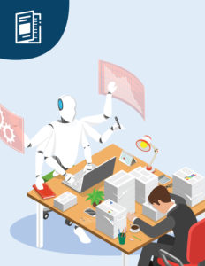


AIS recently completed work on a complete revamp of the Texas Workforce Commission’s “Texas Reality Check” website. Texas Reality Check is an Internet-available, fully accessible, responsive, mobile-first and browser-agnostic design. This website was tested for accessibility, performance, vulnerability scans, and usability.
Background
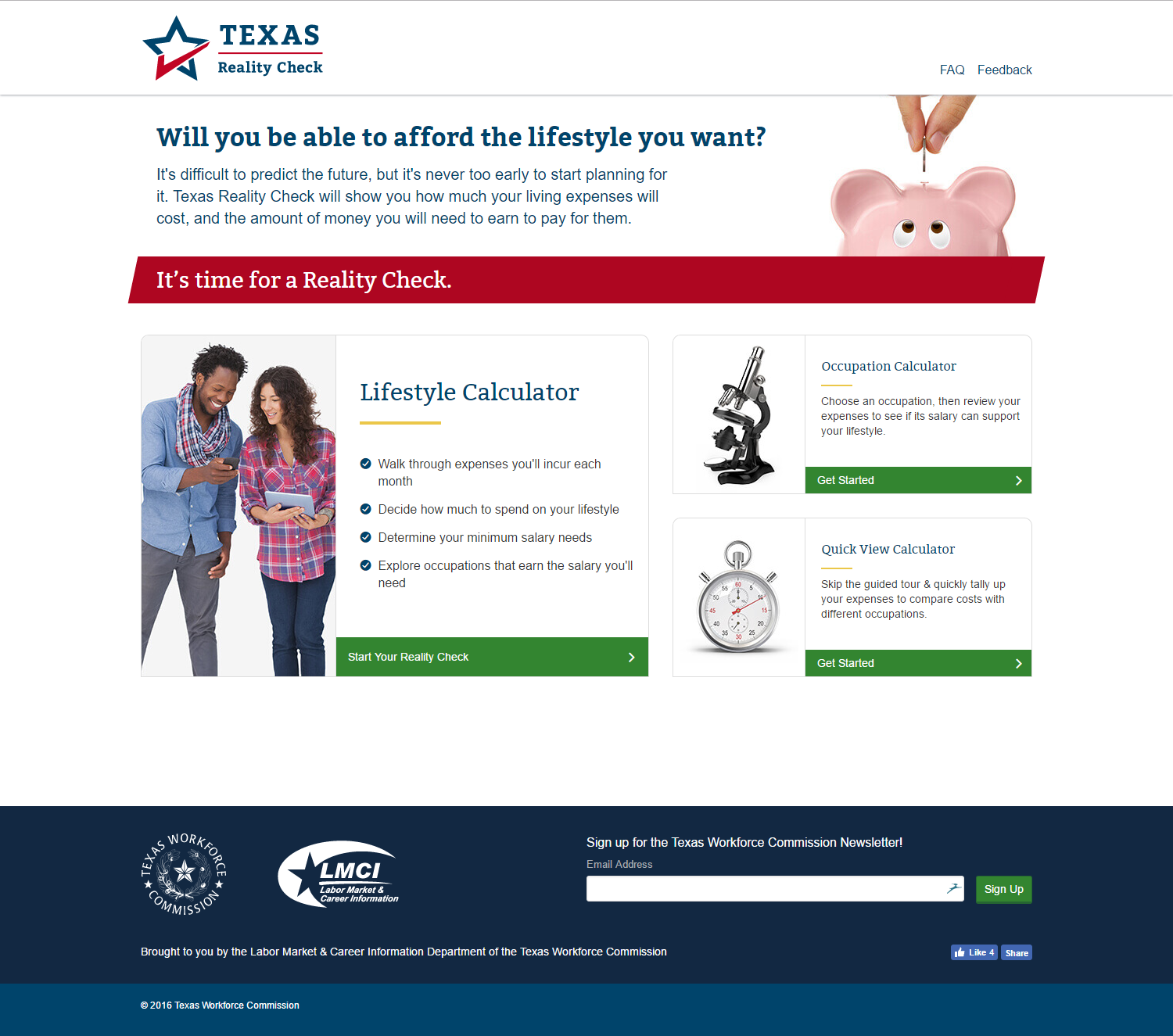
Texas Reality Check (TRC) is targeted at students on a statewide basis, ranging from middle school to high school (with some colleges and universities making use of the tool for “life skills” classes). The goal is to inspire students to think about occupations, and prepare for educational requirements so they can achieve the income level that meets their lifestyle expectations.
This tool walks students through different areas of life, on a step-by step-basis, identifying budgets associated with living essentials such as housing, transportation, food, clothing, etc. Students make selections and then calculate a corresponding monthly income that would afford the selections they make. From here, the students are directed to another page and connected to a database on careers and associated salaries.
However, the existing site was dated and in need of improvements in three core areas: UX, Accessibility, and overall performance. Here’s how AIS delivered:
Challenge #1: Content and User Experience
While TRC is a highly valuable tool for Texas’ student population, the site’s presentation and style was outdated, making it difficult for the target demographic to connect and engage with it. To modernize the site and make it relatable, a revised content strategy and updated user experience were needed to better meet the project’s goals.
Texas Workforce Commission (TWC) was very interested in a thorough UX process. Many vendors were telling the agency that they had a UX process; however, they were focused on UI rather than UX. Because of our deep experience in this area, TWC chose AIS to establish and implement a complete UX process.
 We started our research with interviews, discussing the current site’s limitations and challenges with both stakeholders and trainers. The trainers work directly with the students as they use the application, and they provided unique insight into specific issues students encountered as they worked their way through the steps.
The trainers helped us identify an important usability issue: The students go through the application in a step-by-step process (basically following the format of a wizard). Each step is explained to help them understand why they need to consider certain expenses as an adult. But the students would often work through the application without completing their actual assignment (such as printing a specific page or email their teacher) as they would get distracted by looking at different career options. This would frustrate the students as they would have to go back through each and every step of the application again to reach the page they needed to email or print to complete the assignment and receive credit.
As the interviews continued, we did a simple competitive analysis of other existing lifestyle calculators. Knowing the popularity of sharing and social media among our target users, we explored different social media sites to examine if the existing Reality Check site, or other lifestyle calculators we identified, were commonly shared. We found that the existing site was shared, but interestingly enough, the majority of posts and shares we could see were among adult users who found the site on their own. This helped us to identify a secondary user group for the site. While primary users remained teenagers and young adults, knowing that adults used and found value in the site as well impacted many of the decisions we made throughout the design process.
We also evaluated the site’s analytics, specifically looking for pain points or areas of the site that were underutilized. We identified three areas as points of entry for the form, and discovered that one of those entry point options had not been used in the last three years! We recommended eliminating or replacing that option, as there was no value in maintaining it.
Revisiting the usability challenge the trainers had identified, we decided to come up with a “Quick View” option as a new entry point, replacing the one no longer used. For the students who forgot to complete their assignments as they were working through the website, Quick View gives them the ability to go to a 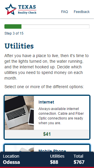 single screen, input the information (from recall on how they had previously answered) and, with one click of the button, arrive at the page they needed…without having to go through all 13 preceding steps. Quick View is also well-suited for secondary and tertiary audiences (such as adults) who were simply interested in seeing the overall data.
Moving beyond research, we worked on the information architecture of the site and restructured and reorganized the sections to simplify the work flow and present them in a logical order that supported the students’ education and understanding as they moved through each step. We did an in-depth content audit and catalogued every piece of information on the site to optimize the structure, eliminate unnecessary content, and ensure that every piece of content was purposeful and thoughtful. We focused on the content strategy of the site and frequently revisited the strategy through the duration of the project. A lot of care, discussion, and analysis went into how each step of the form would be interpreted by the students. We looked for ways to explain concepts to students without being verbose or using words that didn’t resonate with the audience.
There were no existing brand guidelines. We created the logo, color scheme, and overall look and feel from scratch, aiming to make the tone and personality of the site relatable to its young users, while not alienating adults.
Challenge #2: Accessibility
Accessibility was paramount to TWC, as it is for all State agencies. Prior to our engagement, there was only a separate, text-only accessible Reality Check site. A primary TWC goal was to create a single site that was fully accessible and rigorously tested against requirements for accessibility and vulnerability.
In the accessibility world, there are different compliance levels that sites can build to. Federal and state governments are currently mandated to comply with Section 508 standards—this level of compliance is minimal where accessibility is concerned. A better practice within the accessibility community is to build to WCAG (Web Content Accessibility Guidelines) 2.0 AA rating. We met WCAG 2.0 AA rating for this site.
If a site is not accessible, then the accessibility community requests access to a text-only site. In the text-only version, people who are rehabilitated (i.e., with no use of arms) can use different tools or utilize keyboard controls to access the site. However, the overall experience is greatly diminished, as there is no media or imagery. Our goal was to make the website rich, interactive, and fully accessible, with the ability to interact with many different input devices and assistive technologies.
[pullquote]Our goal was to make the website rich, interactive, and fully accessible, with the ability to interact with different input devices and assistive technologies.[/pullquote]As an example, we continually tested with JAWS (Job Access With Speech), which is a Windows-based screen reader. When testing for accessibility, most folks rely on code evaluation tools to validate semantic HTML. However, this method doesn’t enable your understanding of the user experience for a person using assistive technology or different types of input (such as “keyboard only”). While developing the website, our team used only keyboards (eliminating the use of the mouse) to validate the user experience of the rehabilitated audience.
There were other unique features built into the site for the accessibility community, including a video player. There were keyboard controls for the video player, but by using jQuery, the team added a button that allows the user to toggle by hitting the space bar or the enter key. This feature granted greater accessibility to navigate the site, without distracting other users.
Challenge #3: Performance and Testing
Lastly, the previous site had performance concerns, as some counties hold training classes for the students in a bus or trailer. The students join a trainer in the mobile classroom where there are computers set up for them to navigate the website. The students use mobile Internet access with limited connection, and there are performance issues based on peak-time usage during school hours. The site has high activity and would see anywhere from one to two million page views per month, so the site needed be tested against rigorous performance requirements.
TWC went through an extensive eight-week testing process to assess against accessibility, usability, vulnerabilities, and performance and were very satisfied with the findings. Throughout the process, they vetted the site on multiple mobile devices (as students are largely mobile) to ensure that the website was mobile first.
Technology:
- NET MVC
- HTML5
- CSS3
- JavaScript
- jQuery